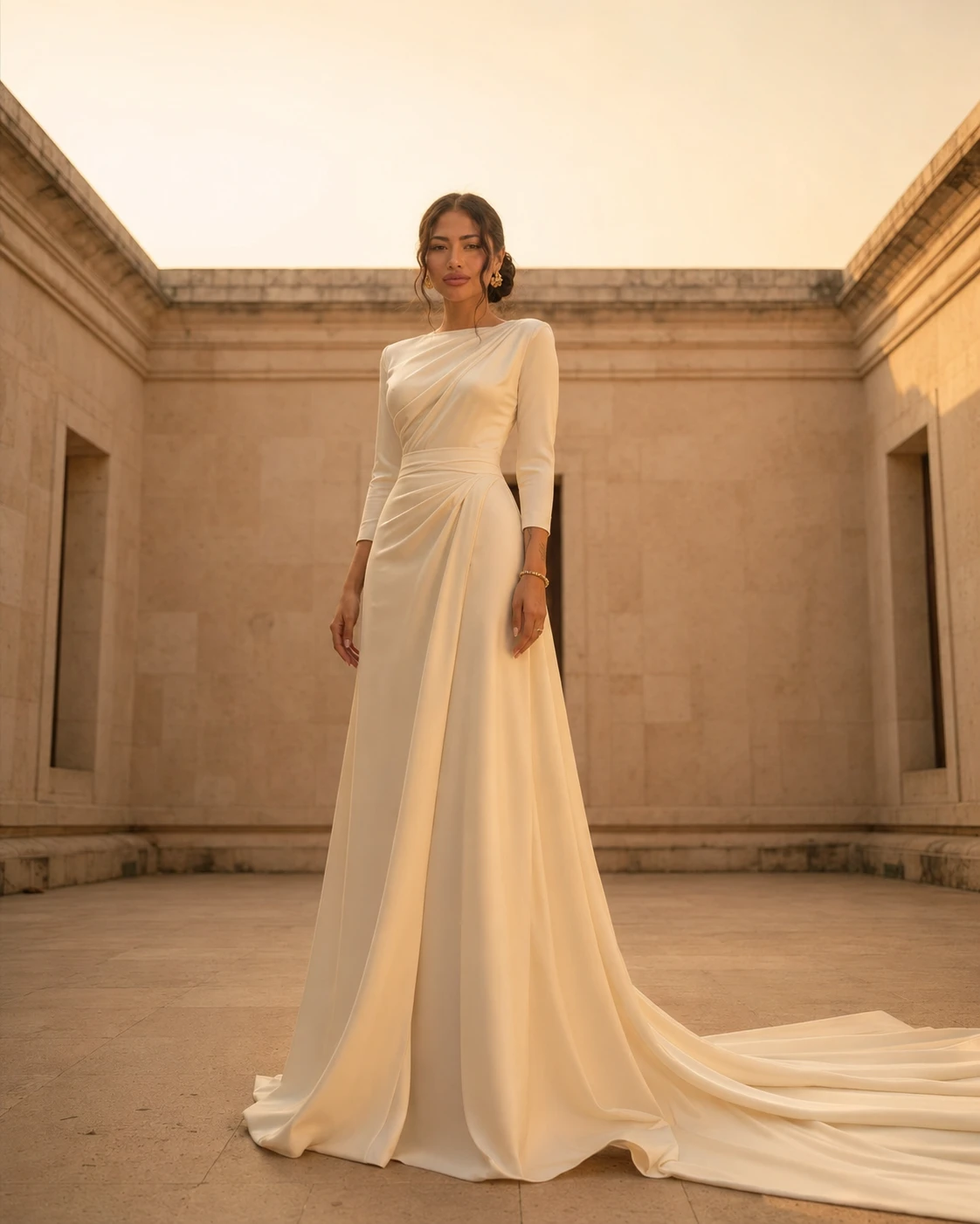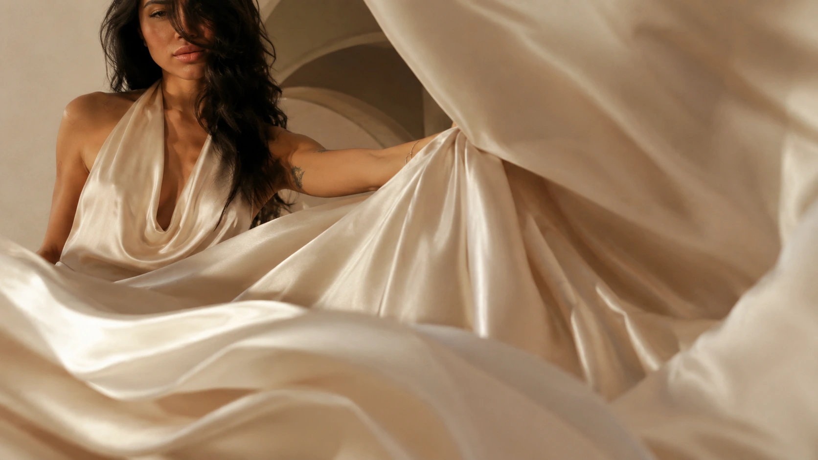
In a palette stripped of colour, texture carries the whole emotion of a garment. How surface — matte, liquid, brushed, slubbed — becomes the protagonist of a design.
There is a moment, in every fitting, when the client stops looking and starts touching. It is involuntary and it is the truest review a garment receives. Before she has decided whether she likes the cut, her fingertips have already decided whether she trusts the cloth. In a house that works without loud colour, this moment is everything — because when you remove hue as the source of drama, texture is no longer decoration. It becomes the subject of the work.
Texture is how a single colour speaks twice
Take one camel and put it across three surfaces and you have, in effect, three colours. Liquid silk-satin throws the light straight back and reads bright, almost wet. Matte linen drinks the light and reads deep and dry. Brushed cashmere holds the light in its raised fibres and reads soft, hazy, lit from within. None of these is dyed differently; the difference is entirely surface. This is the quiet engine of a tonal collection — texture lets a designer compose contrast and rhythm without ever leaving a single family of colour.
The vocabulary of surface
- Matte — light absorbed, the surface dry and grounded; linen, raw silk, brushed wool. The texture of calm.
- Lustrous — light returned, the surface alive and moving; charmeuse, sandwashed silk, fine satin. The texture of occasion.
- Slubbed — the irregular, the hand-felt; the gentle bumps of wild silk and rough linen that prove a human, not a machine, is implied.
- Pile and nap — depth standing up from the cloth; cashmere, velvet, brushed mohair. The texture you want to hold against the cold.
Designing the conversation between two surfaces
A single texture worn alone can feel flat; the interest lives in the meeting of two. A liquid silk slip beneath a dry, structured linen coat. A nubbed raw-silk trouser under a smooth cashmere knit. The contrast is felt before it is seen — the eye registers a difference it cannot quite name until the hand confirms it. The designer's craft is to orchestrate these meetings: enough difference to create tension, not so much that the garment loses its quiet. One smooth, one rough, is usually the whole composition.
“A woman remembers how a thing felt long after she has forgotten how it looked. So I design for the fingertips first, and trust the eye to follow.”
Yaya, Founder & Creative Director
Why the imperfect surface reads as luxury
It seems backwards, but the most expensive cloths are rarely the most uniform. A flawless, machine-perfect surface reads as synthetic; the eye has learned to associate perfection with the factory. The slight slub of a hand-reeled silk, the soft irregularity of a hand-loomed linen, the way fine cashmere is never quite the same twice — these small honesties are what the hand reaches for, because they carry the trace of the natural fibre and the human hand. Texture, designed well, is the place where craftsmanship becomes touchable.
Light is the second designer of texture
No surface has a fixed character; it changes with the light that falls on it. Raw silk that looks plain under a flat showroom lamp comes alive in raking afternoon sun, every slub casting its own small shadow. A satin that gleams at a candlelit dinner goes quiet and matte in grey daylight. So a designer must imagine a garment under the light it will actually live in — and Maison YAYA designs for the long, low, golden light of the Andaman coast, the light that makes texture deepest.
Learn to read texture and a wardrobe stops being a collection of colours and becomes a collection of sensations. You will choose the linen for the way it cools the hand, the cashmere for the way it warms it, the silk for the way it slips — and you will understand, finally, why two beige dresses can feel a world apart, though a photograph would call them the same.