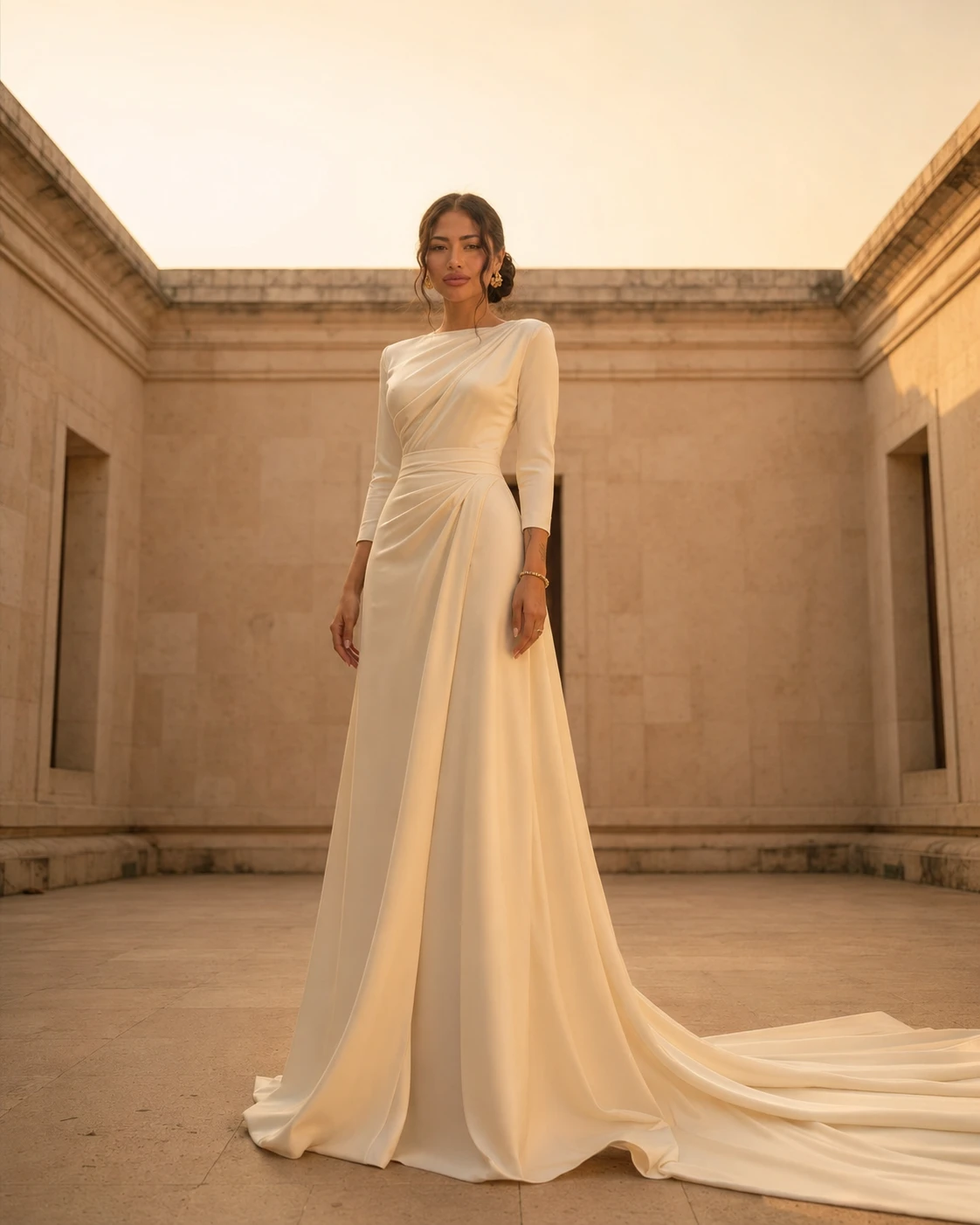
How a luxury house designs an entire collection from ivory to camel — the colour theory behind a neutral palette, and why restraint reads as richness.
To the untrained eye, a neutral collection looks like an absence of decision — beige upon beige, the safe end of the colour wheel. To the trained eye it is the opposite: a palette of neutrals is the hardest thing in fashion to get right, because there is nowhere to hide. Brightness can carry a weak garment across a room. A neutral cannot. It depends entirely on the relationship between one tone and the next, and that relationship is pure architecture.
Value before hue
When most people imagine colour they think first of hue — red, blue, green. A neutral palette asks you to forget hue almost entirely and think in value: how light or dark a tone is, measured as if the world were a black-and-white photograph. The difference between bone and oatmeal is barely a matter of colour at all; it is a matter of two or three steps along a ladder from white to black. Design a collection well and those steps are evenly spaced, so the eye can read camel as the deep note, greige as the middle, ivory as the high one — a chord, not a smudge.
The discipline of temperature
Every neutral leans warm or cool beneath its surface. Camel, oatmeal and ecru carry a breath of gold; greige, dove and oyster carry a breath of blue. A collection that mixes the two without intention looks faintly unwell, the way a warm cream sallows beside a cool white. So a house chooses its temperature the way a composer chooses a key, and holds it. Maison YAYA works almost entirely in the warm family, the colours of unbleached linen and morning sand, because they flatter Thai light and Thai skin alike.
“I do not design with many colours. I design with one colour and many depths of it. The restraint is not poverty — it is where the luxury lives.”
Yaya, Founder & Creative Director
What a neutral palette gives the wearer
- Pieces that combine without thought: any two tones from a single family already agree, so getting dressed becomes a pleasure rather than a puzzle.
- Longevity beyond the season — a colour with no trend attached to it cannot date, and so cannot be retired.
- A frame that flatters the woman, not the cloth: with no loud hue competing for attention, the eye travels to the face.
- The quiet confidence of looking considered without looking costumed.
Where the interest comes from instead
Remove colour as the source of drama and something has to take its place, or the work goes flat. In a neutral collection that something is texture and the play of light. The same camel reads as three different colours across matte linen, brushed cashmere and liquid silk — the silk throwing back the light, the linen drinking it, the cashmere holding it somewhere in between. The designer's real palette, then, is not a set of swatches but a set of surfaces. Tone tells you the family; texture tells you the story.
The single accent, used like punctuation
A purely tonal collection can risk monotony, and the cure is not a rainbow but a single, deliberate accent — a thread of saffron in a hem, a horn button, the cool slate of a stone clasp against warm ivory. Used once, an accent is punctuation; used everywhere it becomes noise. The art is to know that a whole quiet page needs only a single comma to give the eye somewhere to rest, and to resist adding a second.
This is the paradox at the centre of neutral design: the fewer colours you allow yourself, the more precisely each one must be chosen, and the richer the result feels. A great neutral palette is not what is left when you take colour away. It is colour theory practised at its most demanding — and worn so lightly that the woman in it simply looks, somehow, exactly right.